I was playing the game "Dear Esther" and I must say it's one of the best looking games of all time in terms of a realistic feeling, immersive environment. So I thought it would be interesting to look at some of the deign elements the game uses.
The game seems to
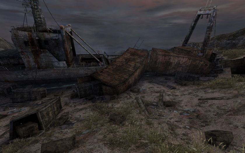
avoid straight polygon lines such as on the roof line in this picture. Lines that
are straight, like the boards piled against the wall, are posed in irregular angles and textures use an effect similar to camouflage with irregular color blobs along the edges to mask them.

You can see the same thing here. I couldn't find a crate from the wrecked ship that was a perfect cube. Everything was bent in a slight angle.
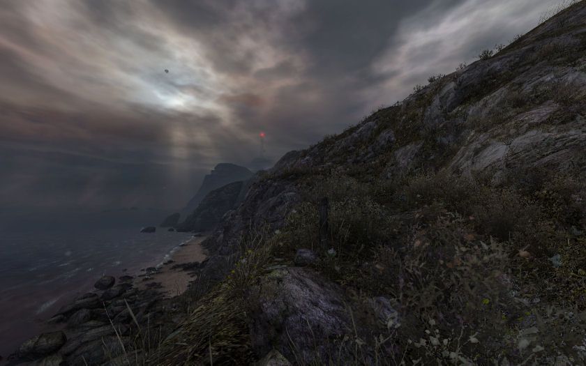
The ground of the
map is raised in a very realistic land-mass shape. Even though it's mostly just covered with a flat texture, the realistic shape of the land makes it feel far more immersive. I'd guess that real reference data (photos, maps etc) were used in the construction.
 Choosing to model subjects with expectedly straight lines can enable low polygons with a feeling of high detail
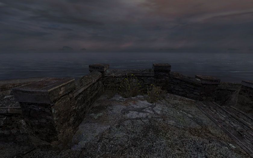
. A lot of the models in the game use quite a low-polygon count but still look amazing and it frequently chooses to model parts made after real objects which have straight lines. For instance, I've seen real walls constructed exactly like the ones pictured below. They use a cap of flat cement on top of natural curved rocks. So even though the wall model is extremely low polygon, it doesn't look as fake as it would if the model was a mimicking a pure natural-rock wall.
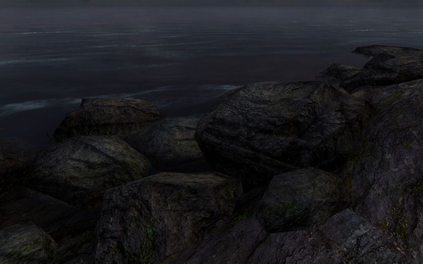
The rocks are quite low-poly too, but the game uses the polygon lines to reinforce an appearance of natural striation layer lines.
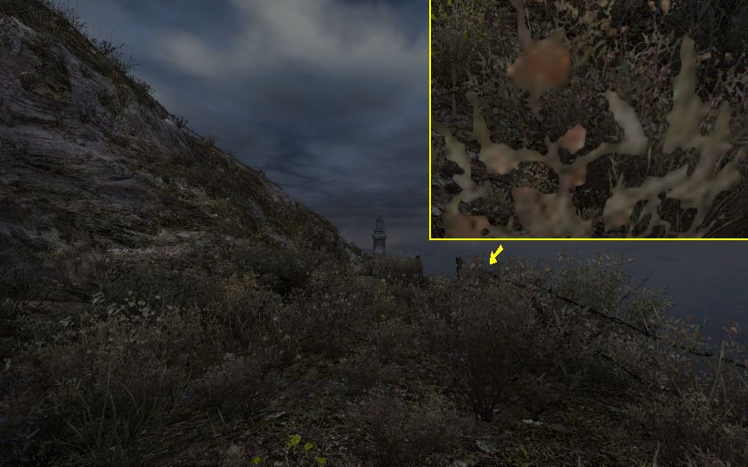
 Plant positioning, coloring and type are consistent to what you expect to see together in the real world.
 They are actually just flat single poly "billboards" with undetailed, blobby textures, but their positioning, coloring and type make an overall immersive feeling.
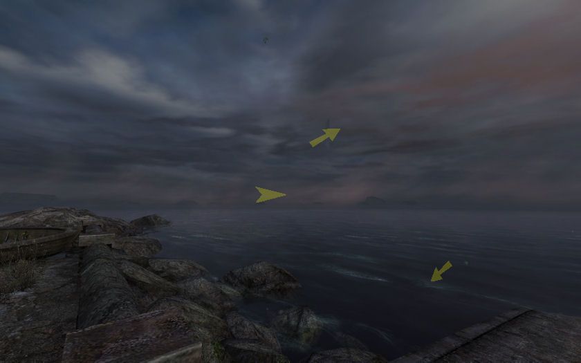
The game uses a staggering amount of
subtle motion at any give time. In the picture, the horizon fog was drifting right, clouds drifting overhead, waves toward shore, sporadic dust clouds blew toward the player, and plants bobbed in the wind. In the real world things are almost always moving subtly so this seems to add a lot of immersion. I've seen some games that use excessive motion (Gothic 4) and can become very obnoxious. I think slight, slow and sporadic is the way to go.
 Sound
Sound unquestionable plays a huge part in this games realism. Wind-gust noises are played now and then as well as occasional unexplained, but natural sounds nearby- cracking wood etc. Sound may be one of the easiest things a game maker can use to create realism. Again, I think subtle and sporadic is the way to go.